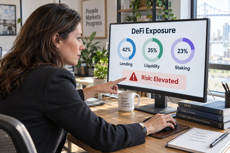
A person who opens a single decentralized finance position, depositing stablecoins into a lending protocol, providing liquidity to a trading pool, staking a token to earn rewards, generally has little trouble tracking that one position. The interface for the specific protocol they used shows the deposit, the current yield, and whatever collateral or risk metrics apply. The difficulty begins the moment that same person opens a second position on a different protocol, and compounds further once a third position sits on an entirely different blockchain network, since decentralized finance, almost by design, has no single company, no single interface, and no single ledger that spans every protocol a user might interact with. Within a year or two of active participation, a reasonably engaged DeFi user can easily accumulate a dozen or more open positions, lending deposits earning interest, liquidity pool shares exposed to two or more tokens at once, staked assets locked for a fixed period, spread across several different blockchain networks that, from a technical standpoint, share no common database and often no common security assumptions with one another.
This fragmentation is not simply an inconvenience; it creates a genuine, well-documented risk problem that has no close equivalent in conventional finance. A bank customer with accounts at three different banks can, at minimum, expect each individual bank to send monthly statements, and increasingly can link those accounts into a single aggregated view through services many traditional banks and financial apps now offer as a matter of course. A DeFi user with positions across three different protocols on two different blockchains has no equivalent default aggregation, no monthly statement, and, until relatively recently, no reliable, free tool that would show every position, every accruing yield, and every collateralization ratio in a single unified view without the user manually visiting each protocol’s own separate interface, on each separate chain, checking each position one at a time, a manual process tedious enough that it invites exactly the kind of oversight, a forgotten position, an unnoticed change in collateral value, an unrevoked but risky token approval, that can turn into a real financial loss.
DeFi portfolio dashboards emerged specifically to close this gap, building tools that connect to a user’s wallet addresses, read the public blockchain data associated with those addresses across dozens of supported networks and hundreds of supported protocols, and assemble everything into a single, continuously updated view: total portfolio value, the specific composition of every lending, liquidity, and staking position, and, in the more sophisticated tools examined later in this article, risk indicators like collateralization health and outstanding token approvals that a user might otherwise have no easy way to monitor across their full set of holdings at once. These tools have grown from a niche convenience used mainly by technically sophisticated early DeFi participants into genuinely significant pieces of the broader DeFi ecosystem’s infrastructure, with the two most prominent examples examined in this article, at various points, serving millions of active users and aggregating tens of billions of dollars in tracked value across the wider DeFi landscape.
This article examines how these dashboards actually work and why the specific problem they solve matters as much for risk management as for simple convenience. It begins by explaining precisely why DeFi positions are so much harder to track than conventional financial holdings, then breaks down what a dashboard actually does technically, aggregating scattered on-chain data into a single readable view, and translating that raw data into risk signals a user can act on. It then turns to two real, closely documented case studies, DeBank and its Rabby Wallet product’s specific approach to transaction-level risk scanning, and Zapper’s rise to serving more than two million monthly active users before its announced shutdown in 2026, before examining, with specific evidence, how a clear aggregated view of a portfolio has been shown to change user behavior around risk, and closing with an honest look at the real limits and blind spots that remain even in the most capable dashboards available today.
The distinction between convenience and genuine risk management runs throughout this article’s analysis, and it is worth stating upfront because the two are often conflated in casual discussion of these tools. A dashboard that simply saves a user the trouble of opening several browser tabs is providing real, tangible value, but the more consequential claim this article investigates is the stronger one embedded in its framing, that a clear, aggregated view does not just save time, it changes what risks a user actually notices and acts on, catching problems that would otherwise go undetected until they had already become costly. Distinguishing between these two forms of value, time saved and risk actually avoided, is essential for evaluating what these tools are genuinely worth to a DeFi participant, and this article treats the stronger, risk-focused claim as the one requiring real, documented evidence rather than simply assuming convenience automatically translates into safety.
Why DeFi Positions Are So Hard to See Clearly
The core of the visibility problem traces back to a structural feature of blockchain technology that is, in most other contexts, considered a genuine strength: decentralization itself. Each blockchain network, Ethereum, and the dozens of separate networks that have launched since, operates as its own independent, self-contained ledger, with its own validators, its own transaction history, and no built-in mechanism for automatically communicating a user’s holdings or activity to any other network. A position opened on one network is, from the perspective of every other network, simply invisible, unless a separate piece of software is specifically built to read that first network’s data and present it alongside data read from the others, which is precisely the technical function a portfolio dashboard exists to perform.
Within any single blockchain network, the same fragmentation problem repeats itself at the protocol level. A lending position on one protocol, a liquidity pool share on a second, and a staking position on a third are each represented by entirely separate smart contracts, each with its own data structure, its own way of representing a user’s balance and accrued interest, and no shared standard that would let a single, simple query retrieve all three at once. Some standardization efforts have improved this over time, but a genuinely comprehensive view still requires software capable of individually understanding and correctly interpreting dozens or hundreds of distinct protocols’ separate data formats, a considerable technical undertaking that is precisely why building and maintaining a capable DeFi dashboard has proven to be a genuinely difficult, ongoing engineering task rather than a simple one-time integration.
This fragmentation compounds specific financial risks that a unified view would otherwise catch early. A lending position’s collateralization ratio, the relationship between the value of assets a user has deposited as collateral and the value of what they have borrowed against it, can deteriorate as market prices move, and if that ratio falls below a protocol’s required threshold, the position can be automatically liquidated, often at a meaningful financial penalty to the borrower. A user monitoring only one of several open lending positions at a time, because checking all of them individually across multiple separate interfaces is simply too tedious to do consistently, runs a real risk of missing exactly this kind of deterioration on a position they are not actively watching at the moment prices move against them, a risk that has contributed to real, documented liquidation losses across the DeFi ecosystem during periods of sharp market volatility, precisely the moments when comprehensive, real-time visibility across every open position matters most and manual, protocol-by-protocol checking is least practical.
Cross-chain fragmentation adds a further, separate layer of difficulty beyond simply visiting multiple interfaces, since each blockchain network typically requires its own separate wallet configuration, its own native token to pay transaction fees, and, in many cases, its own separate browser extension or application to even view balances at all. A user active on Ethereum, a separate layer-two scaling network, and an entirely independent blockchain like Solana is, in effect, managing three functionally separate financial environments that share no common login, no common balance display, and no common notification system that might otherwise alert them to a change in one environment while they are focused on another. This is meaningfully different from, for example, managing multiple brokerage accounts in traditional finance, where each account is still typically accessible through a common web browser and governed by broadly similar regulatory and interface conventions; DeFi’s cross-chain fragmentation is a deeper, more structural form of separation baked into the underlying technology itself, which is precisely why solving it requires dedicated aggregation software rather than simply better personal organization on the user’s part.
What a DeFi Portfolio Dashboard Actually Does
Stripped down to their core technical function, DeFi portfolio dashboards perform two distinct jobs, examined in detail in the subsections that follow. The first is aggregation: connecting to one or more wallet addresses a user provides, and systematically reading the public, on-chain data associated with those addresses across every supported blockchain network and protocol, reconstructing a complete picture of open positions that would otherwise require visiting dozens of separate interfaces individually. The second job, arguably the more valuable one for the risk-management theme this article is centrally concerned with, is translation: taking that raw, aggregated data, numbers and contract states that are, in their native form, not especially readable or actionable to an ordinary user, and converting it into clear, comparable metrics, a portfolio’s total value, a lending position’s current health factor, a flagged risky token approval, that a user can actually understand and act on without needing to independently interpret raw blockchain data themselves.
These two functions build directly on one another, and the quality of a given dashboard’s risk-translation layer depends heavily on the completeness and accuracy of its underlying aggregation layer; a dashboard that fails to correctly read a specific protocol’s data, whether because that protocol is simply not yet supported or because of a bug in how the dashboard interprets it, cannot meaningfully warn a user about risk in a position it has failed to see in the first place. This dependency is part of why the specific breadth of protocol and chain support a given dashboard offers, examined directly in the two case studies later in this article, functions as a genuinely meaningful, comparable metric of a dashboard’s overall usefulness rather than simply a marketing statistic, since a dashboard that supports fewer chains or protocols is, by definition, providing an incomplete and therefore potentially misleading picture of a user’s true total risk exposure.
The two functions also differ considerably in how visibly and directly their quality can be evaluated by an ordinary user, a distinction worth noting because it shapes how carefully a user ought to scrutinize a given dashboard before relying on it for genuine risk decisions rather than casual browsing. Aggregation quality is comparatively easy to spot-check: a user can compare a dashboard’s reported balance for a specific position against that same position’s balance as shown directly on the underlying protocol’s own interface, and any material discrepancy is usually straightforward to identify. Risk-translation quality is considerably harder for an ordinary user to independently verify, since correctly judging whether a displayed health factor, risk score, or approval warning is actually well-calibrated requires exactly the kind of underlying technical expertise the dashboard exists to make unnecessary in the first place, a genuine tension this article returns to directly in its later discussion of the limits of relying on any single dashboard’s judgment.
Aggregating Lending, LP, and Staking Positions Across Chains
The technical process behind position aggregation begins with a wallet address, the public, shareable identifier associated with a user’s holdings on a given blockchain, which a dashboard uses to query that network’s public transaction history and current contract states rather than requiring any private key, password, or other sensitive credential, an important distinction that lets most portfolio dashboards operate in a read-only capacity without ever gaining the ability to move a user’s actual funds. For each supported blockchain network, the dashboard’s backend systems maintain a continuously updated index of which smart contracts correspond to which known protocols, lending markets, liquidity pools, staking contracts, and query each of those contracts directly for any balance or position associated with the user’s provided address, a process that has to be repeated, and kept current, separately for every one of the potentially dozens of networks and hundreds of protocols a comprehensive dashboard aims to support.
Liquidity pool positions present a particular technical complication worth understanding directly, since a single liquidity pool deposit typically represents a claim on two or more underlying tokens simultaneously, in proportions that shift continuously as other traders interact with the pool, rather than a simple, static balance of one specific asset the way a straightforward token holding or lending deposit does. A dashboard has to correctly calculate a user’s current proportional share of a pool’s total holdings, accounting for any trading fees accrued since the position was opened and any divergence between the pool’s current asset ratio and the ratio at the time of deposit, a calculation known as tracking impermanent loss, correctly and continuously for every liquidity position a user holds, across potentially many different pools on many different protocols and chains, in order to present an accurate current value rather than a stale or misleading one.
Staking positions add a further layer of variation dashboards have to account for, since staking mechanisms differ considerably across protocols in ways that directly affect how quickly and accurately a dashboard can reflect a user’s true position. Some staking arrangements let a user’s tokens remain liquid and freely transferable even while earning rewards, represented through a separate receipt token a dashboard can track like any other holding, while others lock the underlying tokens for a fixed period, meaning the dashboard has to separately track both the staked principal and its specific unlock date to give the user an accurate picture of not just what they hold but when, if ever before a fixed date, they could actually access it, a distinction that matters considerably for a user trying to assess their true liquidity and risk exposure at any given moment rather than simply their nominal total portfolio value.
Reward accrual introduces one further wrinkle dashboards have to handle correctly for staking positions specifically, since rewards are sometimes paid out continuously and automatically compounded into the original position, sometimes accrued separately and requiring a distinct claiming transaction before they become part of the user’s spendable balance, and sometimes paid in a different token entirely from the one originally staked. A dashboard that fails to distinguish between rewards already claimed and reflected in a user’s spendable balance versus rewards accrued but not yet claimed risks presenting an inflated, not-yet-actually-accessible total value, a subtle but meaningful accuracy issue that a careful user evaluating a dashboard’s overall trustworthiness would do well to specifically check for when comparing a displayed staking position against the underlying protocol’s own claim interface.
Turning Raw Data Into Risk Awareness
Once a dashboard has successfully aggregated a complete, accurate picture of a user’s positions, the second core function, translating that data into usable risk signals, becomes the layer that most directly determines whether the tool actually improves a user’s financial decision-making or simply presents the same underlying complexity in a marginally more convenient format. The clearest example of this translation function is the health factor, a single, standardized number many lending-focused dashboards calculate and prominently display for every open borrowing position, condensing the underlying collateral value, borrowed amount, and protocol-specific liquidation threshold into one comparable figure that lets a user immediately gauge how close a given position sits to forced liquidation, without needing to manually work through the underlying collateralization math themselves for every position individually.
Token approval risk represents a second, increasingly emphasized category of risk translation that has become particularly important as DeFi-related exploits targeting approved smart contracts, rather than a user’s wallet itself, have grown more common. Interacting with a DeFi protocol typically requires a user to grant that protocol’s smart contract permission, an approval, to move a specific token on the user’s behalf up to some specified limit, a mechanism necessary for the protocol to function but one that, if a user forgets to later revoke an approval for a protocol they no longer actively use, or if a protocol’s own contract is later found to contain an exploitable vulnerability, can expose the user’s tokens to a security risk entirely separate from anything related to the user’s own current, active positions. Dashboards capable of aggregating and clearly displaying every outstanding approval a wallet has ever granted, across every protocol and chain the user has interacted with historically, give users a genuinely useful, otherwise very difficult to reconstruct manually, tool for auditing and reducing this specific category of lingering security exposure, particularly for an active user who may have interacted with dozens of separate protocols over several years and has no realistic way of recalling that full history unaided.
The most capable dashboards extend this translation function further still, aggregating not just individual position-level risk metrics but portfolio-level ones, flagging when a large share of a user’s total holdings sits concentrated in a single protocol or a single blockchain network, a concentration that magnifies the financial consequences if that specific protocol or network experiences a security incident or a sharp, sudden price decline in its native asset. This portfolio-level view is something no single protocol’s own individual interface could ever provide on its own, since each protocol, by design, has visibility only into the positions a user holds on that specific protocol, making the aggregated, cross-protocol dashboard genuinely necessary, rather than simply convenient, for a user who actually wants to understand their true total risk concentration across their full set of DeFi activity.
Notification and alerting systems represent a further, increasingly common extension of the risk-translation function, moving a dashboard from a tool a user has to actively remember to check toward one that can proactively surface a developing problem. Several dashboards now offer configurable alerts that notify a user directly, through email, a mobile push notification, or a connected messaging channel, when a specific position’s health factor crosses a user-defined threshold, when a large, unexpected transaction occurs on a monitored wallet, or when a protocol the user holds a position in becomes the target of a reported security incident elsewhere in the ecosystem. This shift from passive display to active notification addresses a genuine limitation of even the clearest aggregated dashboard view, since a perfectly designed interface still provides no benefit to a user who simply is not looking at it at the specific moment a risk develops, a gap proactive alerting is specifically designed to close.
Case Study: DeBank and Rabby Wallet’s Risk-Scanning Approach
DeBank has built one of the most widely used and most technically comprehensive DeFi portfolio dashboards currently operating, distinguishing itself specifically through the breadth of its protocol and chain coverage and, more recently, through a dedicated wallet product built explicitly around the risk-translation function described in the preceding section. The company raised $25 million in a Series A funding round in December 2021, led by HSG with participation from Youbi Capital, The LAO, SNZ Holding, Ledger Capital, and IOSG Ventures, and followed that with an $11 million Series B round in January 2024 led by Qiming Venture Partners, bringing its total disclosed funding to roughly $36 million across investors that also include Circle Ventures, Coinbase Ventures, and Crypto.com, a group spanning both crypto-native venture funds and firms associated with major, well-established financial and payments companies.
That funding has supported real, documented user growth over the same period. By recent measurement, DeBank reports more than 2.5 million registered users and more than 600,000 daily active users, a figure the company has described as representing roughly a 340 percent increase in daily active usage compared to the prior year, alongside registered wallet addresses growing by approximately 300 percent year over year, growth that reflects DeBank’s positioning as one of the default, widely trusted tools DeFi participants turn to specifically for the cross-chain aggregation function this article has described, supporting more than 50 separate blockchain networks and offering what independent comparisons have generally identified as the broadest protocol coverage among the major dashboards currently operating in the space.
DeBank’s more recent and, for this article’s purposes, more directly relevant development is Rabby Wallet, a browser-based wallet product the company built specifically to extend its dashboard-style aggregated visibility into the moment of an actual transaction, rather than only providing after-the-fact portfolio monitoring. Rabby’s pre-transaction risk-scanning engine evaluates a proposed transaction before a user signs it, labeling known scam contracts, flagging unusually risky or unlimited token approval requests, and scoring the general credibility of the site requesting the signature, while a separate transaction simulation feature shows the user the exact balance changes a transaction will actually produce before they commit to it, catching the specific, well-documented category of DeFi loss that occurs when a user unknowingly signs a malicious transaction disguised as something benign. A further built-in approval-management feature lets a user revoke dangerous or unnecessary outstanding approvals across multiple chains from a single interface, directly operationalizing the approval-risk translation function described in the preceding section rather than simply displaying the risk and leaving remediation entirely up to the user’s own separate effort.
This case study is also worth examining honestly for what it reveals about the limits of even a security-focused product, rather than treating it as an unqualified success story. In October 2022, an attacker exploited a vulnerability specifically in a peripheral swap-related smart contract associated with Rabby, distinct from the core wallet infrastructure itself, draining approximately $200,000 in the process; the company’s own account of the incident, and independent reporting on it, both confirmed that users’ seed phrases and private keys were never placed at risk, since the exploited contract sat outside the wallet’s core custody and signing infrastructure. The incident illustrates a point directly relevant to this article’s broader risk-awareness theme: even a dashboard and wallet product built specifically around identifying and mitigating risk for its users is not itself immune to the same category of smart contract vulnerability its own risk-scanning features are designed to help users detect in other protocols, a genuinely important caveat for any user inclined to treat a risk-focused tool’s own infrastructure as inherently, categorically safer than the protocols it is helping them evaluate.
DeBank’s broader product strategy, extending from a purely passive, read-only tracking dashboard toward an increasingly full-featured wallet and transaction platform, reflects a pattern visible across several of the more successful tools in this category, treating aggregated visibility as a foundation to build additional, more directly actionable features on top of rather than as a standalone, finished product in itself. The company has continued layering additional functionality onto its core aggregation infrastructure, including direct swap and deposit capabilities that let users act on positions the dashboard displays without navigating away to a separate protocol interface, and a social and ranking layer that lets users compare portfolio performance and strategies with other DeBank users, features that extend well beyond the narrower risk-visibility function this article has focused on but that illustrate how a sufficiently comprehensive aggregation layer can become a platform other, more specialized features are built on top of, rather than remaining a single-purpose tracking tool indefinitely.
Case Study: Zapper’s Rise, Scale, and 2026 Shutdown
Zapper offers a different, and in several important respects more cautionary, case study than DeBank, illustrating both how large and genuinely useful a DeFi portfolio dashboard can grow and how difficult sustaining that scale as a viable, ongoing business has proven to be even for a well-funded, widely used product. Founded in 2019, Zapper built its reputation around a clean, well-designed dashboard interface that let users track wallet holdings, yield farming positions, and borrowing status across the DeFi ecosystem, alongside built-in swap and deposit functionality that let users act directly on the positions the dashboard displayed rather than only viewing them, a combination that made Zapper, for much of its operating history, one of the most recognized and widely recommended tools in the broader DeFi portfolio-tracking category examined throughout this article.
The company’s growth over its roughly seven years of operation was substantial by any measure available for a DeFi-focused consumer product. Zapper raised a cumulative $16.5 million across two funding rounds led by Framework Ventures, with participation from investors including Mark Cuban and Coinbase Ventures, and at its peak served more than 2 million monthly active users while processing more than $13 billion in cumulative transaction volume through its interface, figures that place it among the most heavily used consumer-facing DeFi tools built during the sector’s rapid early-2020s growth phase, supporting more than 15 EVM-compatible blockchain networks and offering the kind of comprehensive, multi-protocol visibility this article’s earlier sections describe as genuinely difficult to build and maintain at scale.
Despite that documented scale and usage, Zapper’s leadership announced in July 2026 that the platform would wind down entirely, with founder and CEO Seb Audet confirming the closure would take effect on August 3, 2026, affecting the main web platform, its mobile applications, and its underlying API services that other DeFi products had, in some cases, built their own functionality on top of. The company’s own public explanation for the shutdown centered specifically on business sustainability rather than any single technical failure or security incident: declining revenue as competition in the DeFi dashboard category intensified, narrowing profit margins, and rising infrastructure costs associated with maintaining accurate, real-time data across dozens of supported chains and protocols, combined with what the company’s leadership described as weakening overall market demand and falling user activity across the broader category during 2026.
Zapper’s closure did not occur in isolation, and situating it within the broader pattern of similar 2026 shutdowns adds useful context for evaluating what this case study actually demonstrates about the DeFi dashboard category as a whole rather than treating it as an isolated business failure specific to one company. Cardano-focused analytics service TapTools ceased operations in June 2026, and Botanix, a DeFi platform built specifically for the Bitcoin ecosystem, announced its own closure roughly a week after Zapper’s announcement, citing similarly insufficient market demand, a clustering of shutdowns within a short window that suggests the specific challenge Zapper faced, building a genuinely useful, widely adopted product without a correspondingly sustainable revenue model to support the real infrastructure costs of maintaining it, may reflect a structural challenge across this category of free, aggregation-focused DeFi tooling more broadly rather than a problem unique to Zapper’s own execution or strategy.
The underlying business-model tension Zapper’s shutdown exposes is worth examining directly, since it bears on how durable this entire category of tooling can be expected to remain going forward. Building and maintaining accurate, comprehensive aggregation across dozens of blockchain networks and hundreds of protocols requires substantial, ongoing engineering investment, continuously integrating newly launched protocols, adapting to changes in existing ones, and running the infrastructure needed to index and serve real-time data at scale, yet the dominant model across this category, including Zapper’s own core dashboard product, has historically been to offer this aggregated view for free, monetizing instead through smaller transaction fees on the optional swap and deposit features layered on top of the free tracking functionality. When user growth or trading volume through those optional monetized features fails to keep pace with the underlying infrastructure costs of maintaining comprehensive free aggregation, exactly the dynamic Zapper’s own public explanation for its shutdown described, the resulting business becomes structurally difficult to sustain regardless of how many total users value the free tracking functionality itself, a tension DeBank’s own shift toward a broader, more monetizable product suite may reflect an attempt to avoid.
How a Clear Dashboard Changes Risk Behavior
The two case studies above establish that DeFi portfolio dashboards have reached genuine, documented scale, but the more central question for this article is whether that aggregated visibility actually changes how users manage risk, rather than simply making an already-informed user’s existing habits marginally more convenient. The clearest evidence for a genuine behavioral effect comes from the collateralized lending context described earlier: a health factor displayed prominently and continuously across every open borrowing position, rather than requiring a user to manually calculate or separately check each position on each protocol’s own interface, converts a passive, easy-to-neglect monitoring task into an active, low-effort one, and dashboard providers and DeFi researchers alike have consistently pointed to this kind of always-visible, aggregated health metric as a meaningful factor in reducing the specific category of liquidation losses that occur when a user simply fails to notice a position’s collateral value deteriorating until it is too late to add more collateral or repay part of the loan.
Approval-risk visibility produces a comparably direct behavioral shift, and one that is in some ways easier to observe concretely, since a user’s decision to revoke a previously granted, no-longer-needed token approval is a discrete, directly observable on-chain action rather than an abstract change in awareness. Before dashboards like DeBank and wallet products like Rabby made a user’s full, historical approval list easily visible and directly actionable from a single interface, revoking an approval required a user to already know, from memory or from separately checking a blockchain explorer, exactly which specific contracts they had previously granted permissions to, a genuinely difficult thing to track manually across months or years of DeFi activity spanning dozens of separate protocol interactions; making that list visible and providing a one-click revocation path has demonstrably lowered the barrier to this specific, well-documented security practice enough that it has become a routine, widely recommended part of responsible DeFi participation in a way it simply was not during the ecosystem’s earlier years.
Cross-protocol and cross-chain concentration awareness represents a subtler, but genuinely important, third behavioral shift a unified dashboard view enables. A user who can see, in one place, that 70 percent of their total DeFi holdings currently sit within a single protocol, or within contracts deployed on a single blockchain network, gains a form of risk information no individual protocol’s own interface could ever provide, since each protocol only has visibility into the specific portion of a user’s total activity that occurs on that protocol itself. This aggregated concentration view has become particularly relevant given the DeFi ecosystem’s own documented history of individual protocol and bridge exploits, incidents that have in aggregate resulted in hundreds of millions of dollars in combined losses across the broader ecosystem in recent years, affecting users whose assets happened to be routed through or held within whichever specific bridge or protocol was compromised at the time, regardless of how diversified those same users might have believed their overall holdings to be when assessed only one chain at a time rather than as a single, unified whole. A user who might have felt reasonably diversified when looking only at a single chain’s activity could, once shown a genuinely unified cross-chain view, discover their actual risk concentration in a specific protocol or network is considerably higher than they had assumed, prompting a rebalancing decision the fragmented, pre-dashboard status quo would have made considerably harder to arrive at through casual, unaided observation alone.
This behavioral shift extends to how users respond to breaking security news elsewhere in the DeFi ecosystem, a category of risk response that aggregated visibility has measurably improved. When a specific protocol or bridge is reported to have suffered an exploit, a user’s most urgent practical question is whether they personally hold any exposure to that specific protocol, directly or indirectly through a liquidity pool or lending market that itself has exposure to it, a question that, without an aggregated view, requires the user to separately recall and check every position they have ever opened against the news, under real time pressure, precisely the conditions under which manual, memory-dependent checking is most likely to miss something. A dashboard that lets a user search or filter their aggregated holdings by protocol name in seconds, rather than reconstructing that list from memory, meaningfully shortens the window between a security incident becoming public and an affected user actually recognizing their own exposure and taking protective action, a genuinely time-sensitive form of risk awareness that has no close equivalent in the fragmented, dashboard-free alternative, where the same search would instead require manually recalling and individually revisiting every protocol interface the user has ever touched.
The Limits and Risks of Relying on a Dashboard
For all the genuine value described above, DeFi portfolio dashboards carry real, specific limitations that a responsible user needs to understand rather than treating any single dashboard’s displayed numbers as an infallible source of truth. Data lag represents the most immediate practical limitation: while most dashboards aim for near-real-time updates, the underlying process of indexing dozens of blockchain networks and hundreds of protocols at scale inevitably introduces some delay between an on-chain event, a price movement, a liquidation, a new transaction, and that event being correctly reflected in a dashboard’s displayed figures, a lag that is generally small under normal conditions but that has, during periods of extreme network congestion or rapid market movement, been documented to widen enough that a user relying entirely on a dashboard’s displayed numbers during a fast-moving event could be acting on data that is already meaningfully stale. Network congestion itself tends to worsen precisely during the kind of sharp, sudden price movements that make accurate, current data most valuable, since a spike in market volatility typically triggers a corresponding spike in on-chain transaction activity as traders across the ecosystem simultaneously attempt to adjust positions, a surge in network activity that can slow the underlying blockchain data a dashboard depends on at exactly the moment that data is changing fastest and mattering most, a genuinely unfortunate but structurally unavoidable correlation between market stress and reduced dashboard reliability.
Protocol and chain coverage gaps present a second, structurally unavoidable limitation, since no dashboard, however well resourced, can realistically achieve complete, simultaneous coverage of every protocol across every blockchain network at the exact moment each one launches, meaning a user’s true total risk picture is only ever as complete as whatever subset of their actual activity the specific dashboard they are using has successfully integrated and correctly interpreted. A position held on a newly launched protocol not yet supported by a given dashboard simply will not appear in that dashboard’s aggregated view at all, creating a genuine blind spot that is, by its nature, invisible to the user relying on the dashboard specifically because the dashboard itself has no way to flag the existence of data it has not yet been built to read, a limitation meaningfully different from, and in some ways more dangerous than, an error the user could at least potentially notice and correct.
This gap tends to be widest precisely where risk is often highest: newly launched protocols, still unaudited or only recently audited, frequently attract early users specifically because of unusually high advertised yields meant to bootstrap initial liquidity, yet those same newly launched protocols are, almost by definition, the ones a comprehensive dashboard has had the least time to integrate and correctly support. A user chasing an attractive new yield opportunity on a protocol not yet covered by their usual dashboard is, in effect, operating during exactly the window when they have the least aggregated visibility into their own risk, an uncomfortable but genuine mismatch between where dashboard coverage is strongest, established, well-audited, widely used protocols, and where a meaningful share of DeFi’s more speculative activity, and correspondingly higher risk, actually concentrates.
The distinction between a read-only dashboard and a full wallet product carries its own important, easy-to-overlook risk implications. A pure portfolio-tracking dashboard that only reads public wallet data, without ever requesting signing permissions, carries essentially no direct custody or transaction risk of its own, since it cannot move a user’s funds regardless of whether the dashboard’s own infrastructure is ever compromised. A product like Rabby Wallet, which extends aggregated visibility into an actual transaction-signing tool, necessarily takes on a different and generally higher category of risk, since it is directly involved in the mechanics of actually authorizing transactions, which is precisely why the October 2022 exploit examined in this article’s DeBank case study matters as more than an isolated incident: it illustrates that the added convenience and risk-mitigation value of an integrated wallet-and-dashboard product comes paired with an expanded attack surface that a purely passive, read-only tracking tool does not carry to nearly the same degree.
Finally, and perhaps most fundamentally, a dashboard’s own business viability is itself a form of risk a user implicitly takes on by relying on it, a point Zapper’s 2026 shutdown demonstrates with unusual clarity. A user who had built real workflows, saved watchlists, and habitual risk-monitoring routines around Zapper’s specific interface lost access to that entire accumulated infrastructure with roughly a month’s notice between the shutdown announcement and the platform’s actual closure, a reminder that even a widely trusted, well-funded, multi-million-user tool remains, in the end, a business subject to the same revenue and sustainability pressures as any other company, and that a user’s underlying DeFi positions, which continue to exist independently on their respective blockchains regardless of any single dashboard’s operating status, are considerably more durable than any single third-party tool used to view and monitor them.
A related, more subtle risk worth naming directly concerns how much trust a user implicitly places in a dashboard’s own risk-scoring judgment once they become accustomed to relying on it. A health factor, a risk score, or an approval warning is, however well engineered, still the output of one specific company’s own methodology and thresholds, which may differ meaningfully from another dashboard’s methodology for calculating what appears to be the same underlying metric, and a user who has grown accustomed to trusting one specific tool’s particular risk thresholds without understanding the underlying calculation risks developing a false sense of precision about numbers that, in reality, still involve real methodological choices and judgment calls on the part of the tool’s developers. This is not a reason to distrust these tools broadly, given the genuine, documented behavioral improvements described earlier in this article, but it is a reason to treat any single dashboard’s risk metrics as a well-informed, structured opinion rather than an objective, universally agreed-upon fact, particularly when a position sits close to a displayed threshold and the underlying calculation genuinely matters for a real financial decision.
Final Thoughts
The evidence examined throughout this article points toward a genuinely positive, well-documented conclusion about the core value DeFi portfolio dashboards provide, while also surfacing real limitations that keep that value from being unconditional or risk-free. DeBank’s growth to more than 2.5 million registered users and Zapper’s peak of more than 2 million monthly active users and $13 billion in processed volume both demonstrate that the underlying problem these tools solve, the genuine difficulty of tracking scattered lending, liquidity, and staking positions across a fragmented, multi-chain DeFi ecosystem, is real, widely shared, and valuable enough that millions of users have chosen to rely on purpose-built aggregation tools to solve it rather than attempting to track everything manually across dozens of separate protocol interfaces.
The specific link this article has traced between aggregated visibility and improved risk behavior, clearer health-factor monitoring reducing preventable liquidations, easier approval auditing reducing lingering security exposure, and cross-chain concentration awareness prompting more deliberate diversification decisions, represents the more socially significant finding beneath the raw user-growth numbers. Financial inclusion in decentralized finance has always depended on more than simply making participation technically possible; it depends on making informed, risk-aware participation genuinely accessible to users who are not full-time blockchain engineers capable of manually auditing smart contract risk themselves, and the translation layer these dashboards provide, converting raw, technically dense on-chain data into clear, actionable risk signals, is precisely the kind of accessibility improvement that determines whether decentralized finance’s broader promise of open, permissionless participation actually extends to ordinary users or remains functionally limited to a technically sophisticated minority capable of navigating the ecosystem’s underlying complexity unaided.
At the same time, Zapper’s 2026 shutdown, and the broader cluster of similar closures across the DeFi tooling category around the same period, is a genuine, sobering data point about how far this category still has to mature before its usefulness can be considered fully durable rather than contingent on a specific company’s ongoing financial viability. A dashboard’s value to a user depends entirely on that dashboard continuing to exist, be maintained, and remain accurate, none of which is guaranteed simply because a tool has previously reached significant scale, and users who have come to depend on these tools for genuine risk management, not just convenience, would do well to treat any single dashboard as a valuable but replaceable lens onto their positions rather than as an irreplaceable piece of infrastructure, keeping in mind that their actual underlying assets and positions persist on their respective blockchains regardless of which specific tool they happen to be viewing them through at any given moment.
The broader trajectory suggested by DeBank’s continued growth alongside Zapper’s closure is less a story of the dashboard category failing than one of it consolidating and specializing, with tools that successfully pair genuine aggregation depth with a sustainable, diversified product strategy, extending into wallet functionality, transaction execution, or other monetizable features, proving more durable than tools that remained purely free, single-purpose trackers regardless of how large their user base grew. For a DeFi participant deciding how much to rely on any given dashboard today, the most prudent approach is to treat these tools as genuinely valuable, evidence-backed aids to risk-aware decision-making, while maintaining enough independent understanding of one’s own actual positions, across whichever protocols and chains they happen to be held on, that the sudden loss of any single tool would be an inconvenience to work around rather than a total loss of visibility into one’s own financial life.
FAQs
- What does a DeFi portfolio dashboard actually do?
It connects to a user’s wallet address and reads public blockchain data across multiple chains and protocols, aggregating lending positions, liquidity pool shares, and staking balances into a single, continuously updated view rather than requiring the user to check each protocol’s own separate interface. - Do these dashboards require access to my private keys?
Most portfolio dashboards operate in a read-only capacity using only a public wallet address, requiring no private key or password. Wallet products that also let you sign transactions, like Rabby Wallet, carry a different, generally higher risk profile since they are involved in transaction authorization. - What happened to Zapper?
Zapper, which reached more than 2 million monthly active users and $13 billion in processed volume, announced in July 2026 that it would shut down completely on August 3, 2026, citing declining revenue, rising infrastructure costs, and weakening market demand. - How much funding has DeBank raised?
DeBank raised $25 million in a Series A round in December 2021 led by HSG, followed by an $11 million Series B round in January 2024 led by Qiming Venture Partners, bringing its total disclosed funding to roughly $36 million. - What is a health factor, and why does it matter?
A health factor is a single number that condenses a lending position’s collateral value, borrowed amount, and liquidation threshold into one comparable figure, letting a user quickly gauge how close a position sits to forced liquidation without manually calculating it themselves. - What is Rabby Wallet’s pre-transaction risk scanning?
It is a feature that evaluates a proposed transaction before a user signs it, flagging known scam contracts, risky token approvals, and simulating the exact balance changes the transaction will cause, helping catch malicious transactions disguised as legitimate ones. - Did DeBank or Rabby ever experience a security incident?
Yes. In October 2022, an attacker exploited a peripheral Rabby Swap smart contract and drained approximately $200,000. The core wallet infrastructure was untouched, and user seed phrases and private keys were never at risk. - Why do dashboards recommend revoking old token approvals?
Granting a protocol permission to move your tokens creates an ongoing exposure even after you stop using that protocol. If the protocol’s contract is later found vulnerable, an unrevoked approval can be exploited, which is why approval-auditing tools have become a widely recommended security practice. - Can I fully trust a dashboard’s displayed numbers during fast-moving markets?
Not entirely. Indexing dozens of chains and protocols introduces some data lag, which can widen during periods of extreme network congestion or rapid price movement, meaning displayed figures may occasionally be slightly stale during exactly the moments precision matters most. - What happens to my DeFi positions if a dashboard shuts down?
Nothing happens to the underlying positions themselves, since they exist independently on their respective blockchains. What is lost is the aggregated view, saved watchlists, and monitoring workflow built around that specific tool, which is why relying on a single dashboard as irreplaceable infrastructure carries its own risk.